> Fetch the complete documentation index at: https://wasp.sh/llms.txt
---
# Auth UI
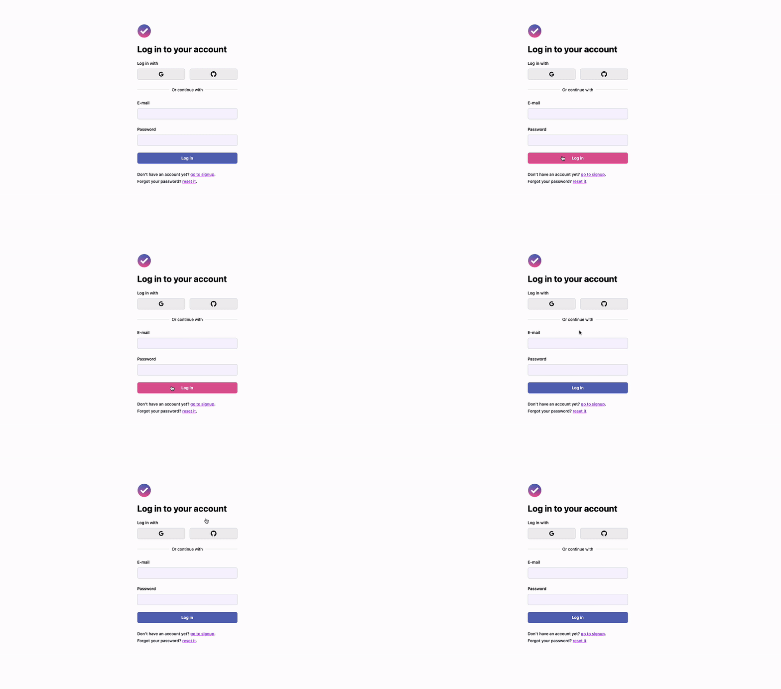
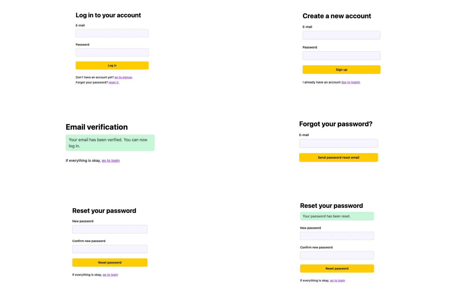
To make using authentication in your app as easy as possible, Wasp generates the server-side code but also the client-side UI for you. It enables you to quickly get the login, signup, password reset and email verification flows in your app.
Below we cover all of the available UI components and how to use them.
:::note
Remember that if you need a more custom approach, you can always [create your own UI](https://wasp.sh/docs/auth/overview#custom-auth-ui).
:::
## Overview
After Wasp generates the UI components for your auth, you can use it as is, or customize it to your liking.
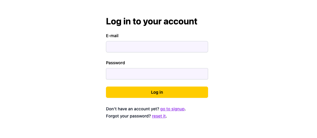
Based on the authentication providers you enabled in your `main.wasp.ts` file, the Auth UI will show the corresponding UI (form and buttons). For example, if you enabled e-mail authentication:
```ts title="main.wasp.ts"
import { app } from "@wasp.sh/spec"
export default app({
name: "MyApp",
//...
auth: {
methods: {
email: {},
},
// ...
},
// ...
})
```
You'll get the following UI:
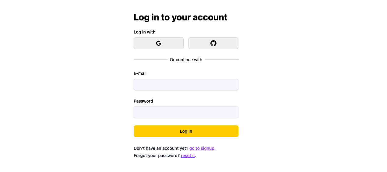
And then if you enable Google and Github:
```ts title="main.wasp.ts"
import { app } from "@wasp.sh/spec"
export default app({
name: "MyApp",
//...
auth: {
methods: {
email: {},
google: {},
gitHub: {},
},
// ...
},
// ...
})
```
The form will automatically update to look like this:
Let's go through all of the available components and how to use them.
## Auth Components
The following components are available for you to use in your app:
- [Login form](#login-form)
- [Signup form](#signup-form)
- [Forgot password form](#forgot-password-form)
- [Reset password form](#reset-password-form)
- [Verify email form](#verify-email-form)
### Login Form
Used with [Username & Password](https://wasp.sh/docs/auth/username-and-pass), [Email](https://wasp.sh/docs/auth/email), [Github](https://wasp.sh/docs/auth/social-auth/github), [Google](https://wasp.sh/docs/auth/social-auth/google), [Keycloak](https://wasp.sh/docs/auth/social-auth/keycloak), [Slack](https://wasp.sh/docs/auth/social-auth/slack) and [Discord](https://wasp.sh/docs/auth/social-auth/discord) authentication.

You can use the `LoginForm` component to build your login page:
```ts title="main.wasp.ts"
import { app, page, route } from "@wasp.sh/spec"
import { LoginPage } from "./src/LoginPage" with { type: "ref" }
export default app({
// ...
spec: [
route("LoginRoute", "/login", page(LoginPage)),
],
})
```
```tsx title="src/LoginPage.tsx"
import { LoginForm } from "wasp/client/auth"
// Use it like this
export function LoginPage() {
return
}
```
It will automatically show the correct authentication providers based on your `main.wasp.ts` file.
### Signup Form
Used with [Username & Password](https://wasp.sh/docs/auth/username-and-pass), [Email](https://wasp.sh/docs/auth/email), [Github](https://wasp.sh/docs/auth/social-auth/github), [Google](https://wasp.sh/docs/auth/social-auth/google), [Keycloak](https://wasp.sh/docs/auth/social-auth/keycloak), [Slack](https://wasp.sh/docs/auth/social-auth/slack) and [Discord](https://wasp.sh/docs/auth/social-auth/discord) authentication.
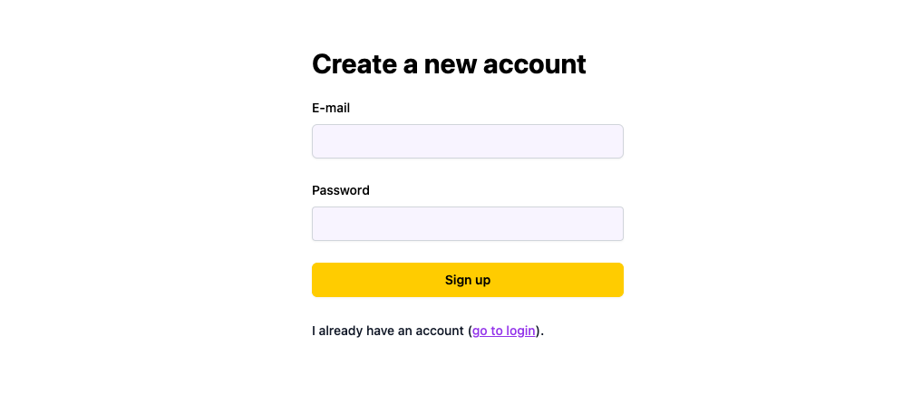
You can use the `SignupForm` component to build your signup page:
```ts title="main.wasp.ts"
import { app, page, route } from "@wasp.sh/spec"
import { SignupPage } from "./src/SignupPage" with { type: "ref" }
export default app({
// ...
spec: [
route("SignupRoute", "/signup", page(SignupPage)),
],
})
```
```tsx title="src/SignupPage.tsx"
import { SignupForm } from "wasp/client/auth"
// Use it like this
export function SignupPage() {
return
}
```
It will automatically show the correct authentication providers based on your `main.wasp.ts` file.
Read more about customizing the signup process like adding additional fields or extra UI in the [Auth Overview](https://wasp.sh/docs/auth/overview#customizing-the-signup-process) section.
### Forgot Password Form
Used with [Email](https://wasp.sh/docs/auth/email) authentication.
If users forget their password, they can use this form to reset it.
*(Inlined image: Forgot password form)*
You can use the `ForgotPasswordForm` component to build your own forgot password page:
```ts title="main.wasp.ts"
import { app, page, route } from "@wasp.sh/spec"
import { ForgotPasswordPage } from "./src/ForgotPasswordPage" with { type: "ref" }
export default app({
// ...
spec: [
route(
"RequestPasswordResetRoute",
"/request-password-reset",
page(ForgotPasswordPage)
),
],
})
```
```tsx title="src/ForgotPasswordPage.tsx"
import { ForgotPasswordForm } from "wasp/client/auth"
// Use it like this
export function ForgotPasswordPage() {
return
}
```
### Reset Password Form
Used with [Email](https://wasp.sh/docs/auth/email) authentication.
After users click on the link in the email they receive after submitting the forgot password form, they will be redirected to this form where they can reset their password.
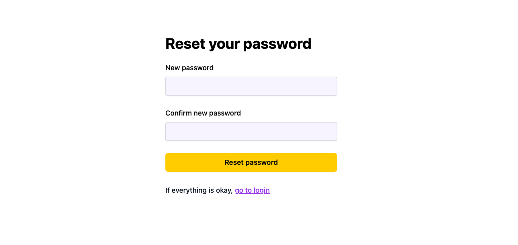
You can use the `ResetPasswordForm` component to build your reset password page:
```ts title="main.wasp.ts"
import { app, page, route } from "@wasp.sh/spec"
import { ResetPasswordPage } from "./src/ResetPasswordPage" with { type: "ref" }
export default app({
// ...
spec: [
route("PasswordResetRoute", "/password-reset", page(ResetPasswordPage)),
],
})
```
```tsx title="src/ResetPasswordPage.tsx"
import { ResetPasswordForm } from "wasp/client/auth"
// Use it like this
export function ResetPasswordPage() {
return
}
```
### Verify Email Form
Used with [Email](https://wasp.sh/docs/auth/email) authentication.
After users sign up, they will receive an email with a link to this form where they can verify their email.
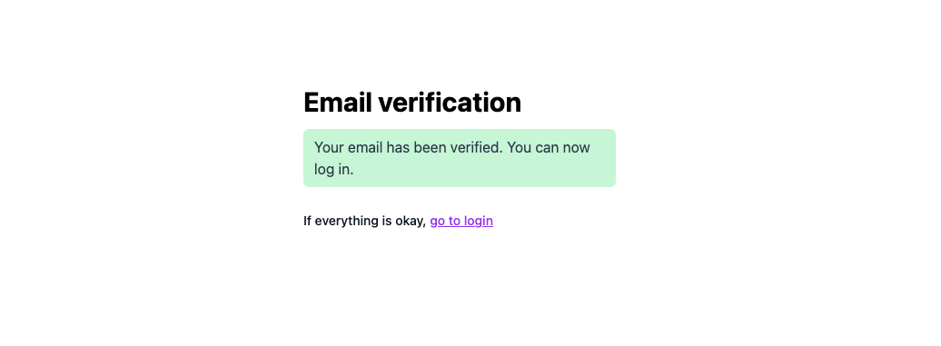
You can use the `VerifyEmailForm` component to build your email verification page:
```ts title="main.wasp.ts"
import { app, page, route } from "@wasp.sh/spec"
import { VerifyEmailPage } from "./src/VerifyEmailPage" with { type: "ref" }
export default app({
// ...
spec: [
route("EmailVerificationRoute", "/email-verification", page(VerifyEmailPage)),
],
})
```
```tsx title="src/VerifyEmailPage.tsx"
import { VerifyEmailForm } from "wasp/client/auth"
// Use it like this
export function VerifyEmailPage() {
return
}
```
## Customization 💅🏻
You customize all of the available forms by passing props to them.
Props you can pass to all of the forms:
1. `appearance` - customize the form colors (via design tokens)
2. `logo` - path to your logo
3. `socialLayout` - layout of the social buttons, which can be `vertical` or `horizontal`
### 1. Customizing the Colors
We use CSS variables in our styling so you can customize the styles by overriding the default theme tokens.
:::info[List of all available tokens]
See the [list of all available tokens](https://github.com/wasp-lang/wasp/blob/release/waspc/data/Generator/templates/sdk/wasp/auth/forms/types.ts) which you can override.
:::
```ts title="src/appearance.ts"
import type { CustomizationOptions } from "wasp/client/auth"
export const authAppearance: CustomizationOptions["appearance"] = {
colors: {
brand: "#5969b8", // blue
brandAccent: "#de5998", // pink
submitButtonText: "white",
},
}
```
```tsx title="src/LoginPage.tsx"
import { LoginForm } from "wasp/client/auth"
import { authAppearance } from "./appearance"
export function LoginPage() {
return (
)
}
```
We recommend defining your appearance in a separate file and importing it into your components.
### 2. Using Your Logo
You can add your logo to the Auth UI by passing the `logo` prop to any of the components.
```tsx title="src/LoginPage.tsx"
import { LoginForm } from "wasp/client/auth"
import Logo from "./logo.png"
export function LoginPage() {
return (
)
}
```
### 3. Social Buttons Layout
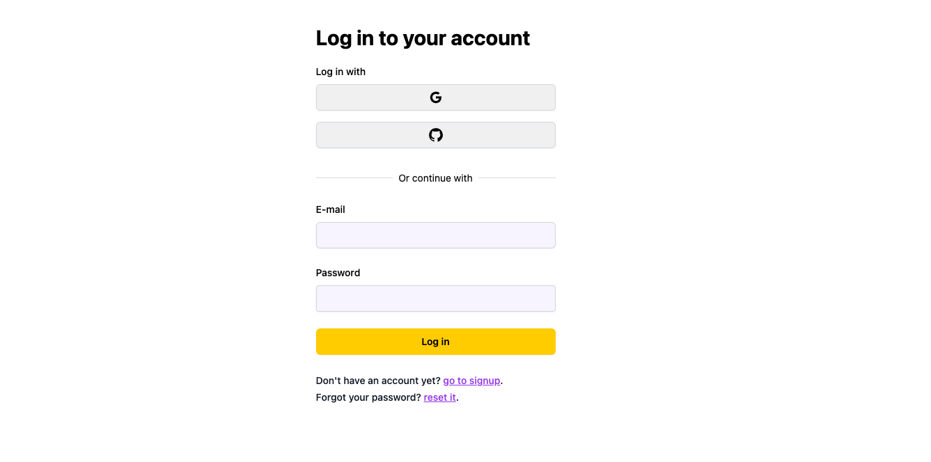
You can change the layout of the social buttons by passing the `socialLayout` prop to any of the components. It can be either `vertical` or `horizontal` (default).
If we pass in `vertical`:
```tsx title="src/LoginPage.tsx"
import { LoginForm } from "wasp/client/auth"
export function LoginPage() {
return (
)
}
```
We get this:
### Let's Put Everything Together 🪄
If we provide the logo and custom colors:
```ts title="src/appearance.ts"
import type { CustomizationOptions } from "wasp/client/auth"
export const appearance: CustomizationOptions["appearance"] = {
colors: {
brand: "#5969b8", // blue
brandAccent: "#de5998", // pink
submitButtonText: "white",
},
}
```
```tsx title="src/LoginPage.tsx"
import { LoginForm } from "wasp/client/auth"
import { authAppearance } from "./appearance"
import todoLogo from "./todoLogo.png"
export function LoginPage() {
return
}
```
We get a form looking like this: